 Just my personal two cents.
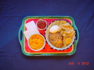
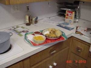
Do you want the pictures you send in to be noticed? Every one is submitting pictures and video clips these days. It's really quite simple to have your work look so much better than the rest of the crowd. Here is a basic example of the difference five minutes thought and a tiny amount of effort can make. Now tell me. Which of these two would you select if you were the editor of a web site or a magazine? (Counter.jpg, and trayNpot.jpg) There isn't much question, is there?


So what did I do in such a brief amount of time that made such a difference? Laying your subject out to its best effect (or presentation) is important to catch the viewer's interest. But, in these examples the presentation on the tray is identical. A high end photographer would go to much bigger lengths, and only have minor results to show for it.
The answer is three little things: background, lighting, and framing. Framing is the easiest. Just step back, or don't zoom too close. There has to be a border all the way around your object. Nobody wants wedding pictures where the feet or the heads are cut off, do they?
More important than framing, is the next thing - the background. You would be amazed at the pictures some people send in to web sites for publication! Everyone should be told, because if you are sending in a recipe you should know. Folks, there is nothing appetizing about dirty laundry or sink full of dishes in the background. Likewise, a half eaten plate of eggs with ketchup doesn't improve the look of a craft project, even if it is a really cool project.
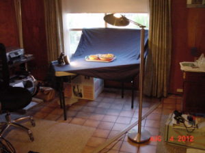
Look at this set up. It took all of 2 or three minutes to put together. I often use a couch as well. Throw a sheet over it and set your object up so you can frame it without a cousin's toes in the picture. It's so simple and makes a huge difference!
Next is lighting. This is the toughest and by far the most important. For the purposes of this article just keep these pointers in mind. Grab a couple of floor lights and point them at the ceiling above, or surround the object with a two or three table lamps and some diffused natural lighting. On a bright day hang a white sheet over the window so the light isn't reflecting of everything (that's the diffused part).

Take a second. Just close one eye, and look at your object. Will the detail you want to be seen be lost in shadows? Is light reflecting off some shiny part of your object? Any glare you see, will be far brighter to the camera. Just change your lighting or close a curtain. Just be sure there isn't strong light coming from behind your object, all you will capture is a silhouette
There are numerous other pointers. Many books have been written on the subject. But these are the most common problems with submitted pictures. Well, that and "is it in focus"?
It can be amazingly hard to get a good picture using a cell phone camera. The good news is that with adequate lighting, a good background, and just a little attention to framing, even a phone camera can usually get a good picture!
Note from DW of TWB, I would have ironed the sheet first, :).
Source: Practice, read, explore, practice, fail, ask, practice. . .
By TWB from Tigard, OR
This page contains the following solutions.
When taking pictures of stuff to sell online, make sure you have a neutral background and good lighting. Otherwise the object won't be seen well and that can affect sales!